Stand out.
Work we’ve done
Hark Ideas has worked with a range of clients to help them create, evolve, and adapt their brands to changes in business strategy and the competitive environment. In some instances the best solution may be primarily strategic, in others a combination of strategy and designed expression – verbal, visual, or both – forms the foundation of an entirely new or vibrantly refreshed brand identity.
We're focused on your results.
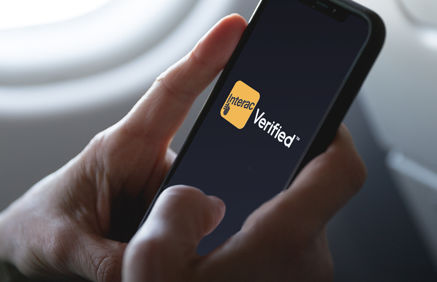

Interac
Naming a new line of business
Interac
Naming a new line of business
Interac is one of the most trusted and innovative financial brands in Canada. Until recently the Interac masterbrand comprised two powerful offerings: Interac® Debit and Interac e-Transfer®.
Naming a new, third pillar of the brand architecture – Interac’s first foray beyond payments – required a name that was on-strategy, ownable across North America, easily used in both English and French, and that harmonized with the existing masterbrand name style.
We applied a disciplined process of strategic name creation – including rigorous linguistic and legal pre-screening – to ensure our proposed selection of name candidates offered the best chance of successful adoption.
The result: Interac Verified™ – the new name for Interac’s user-centric digital identity offering for consumers and businesses.
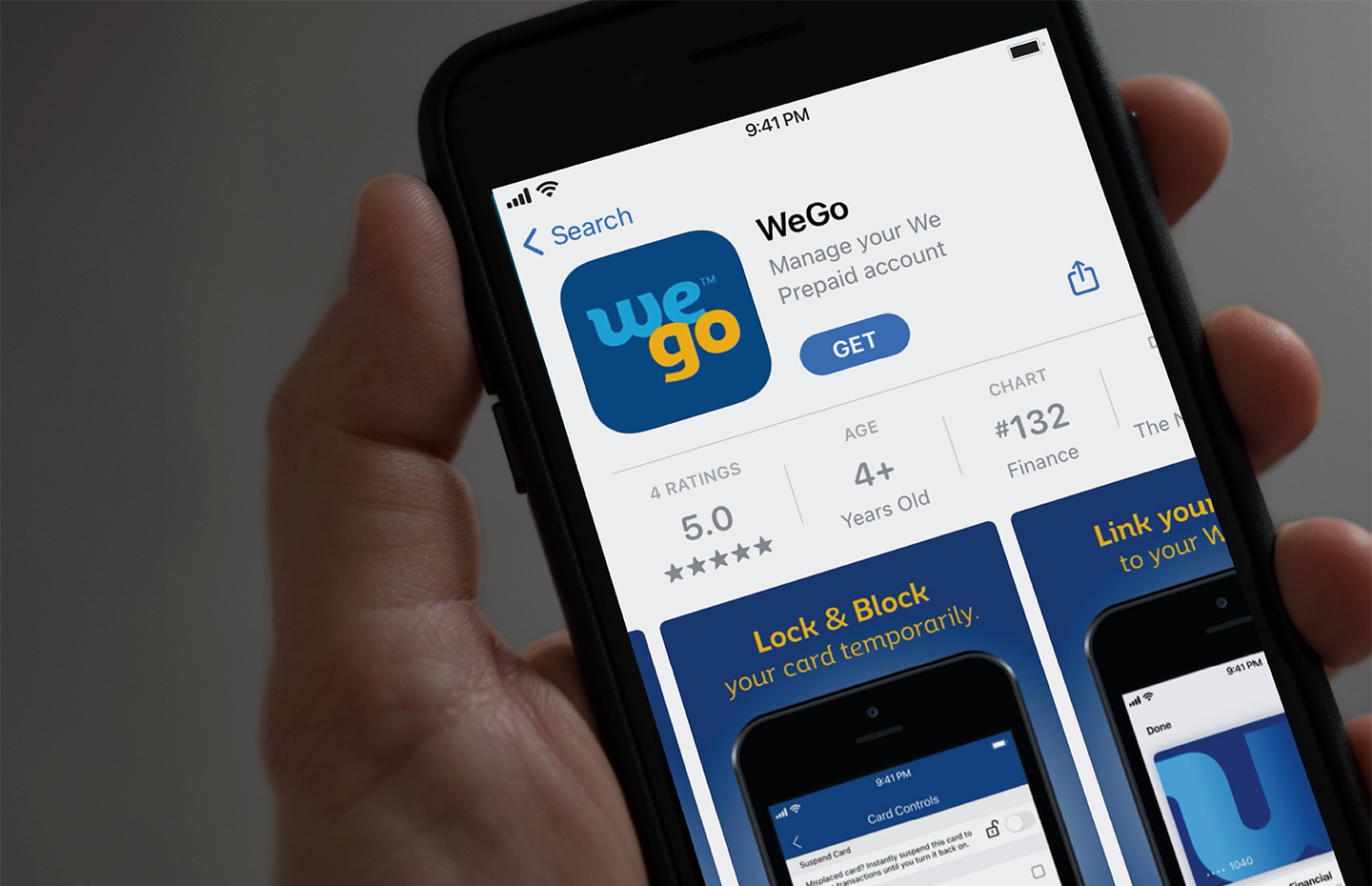
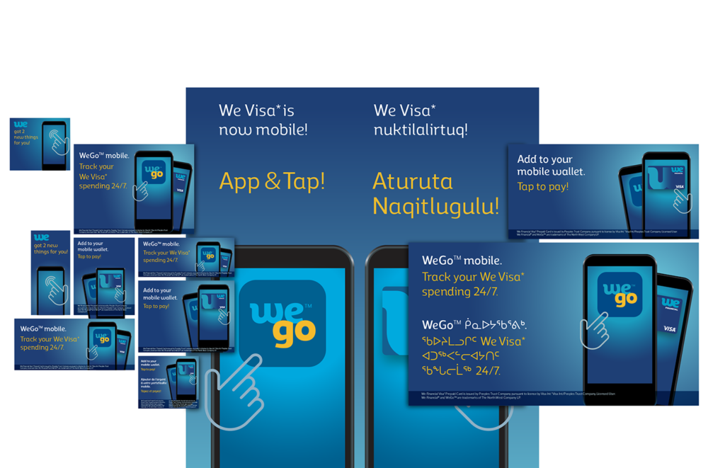
WeGo™ mobile app
Account control on-the-go
WeGo™ mobile app
Account control on-the-go
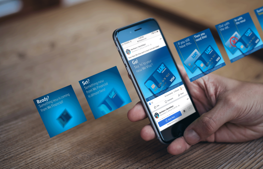
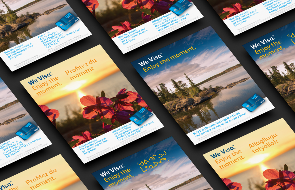
The North West Company asked us to work with them on the launch of their WeGo™ mobile app, designed to give We Visa customers on-the-go access to their We Financial Visa Prepaid account. We undertook the graphic branding of the app (and some UI consultation) and created a three-stage, multi-platform, multi-language campaign to promote the app launch as well as the new mobile wallet compatibility of their popular We Visa prepaid card.
To support the launch and branding of the WeGo™ app, we also created all the requisite artwork elements for the app itself, the Apple App Store, and Google Play.
As with previous We Visa campaigns, the media were very direct and shopper-focused: cash register screens, ATM screens, PIN pad dangler, Facebook ads, website carousel and sidebar ads, direct mail, handbill, and POS posters and TV monitors. The ad strategy was to be very bold, simple, direct, and visually focused, given the very brief exposure offered by the mostly out-of-home digital media and the fact the creative was to be published in various combinations of English, French, Inuktitut, and Inuinnaqtun.
Permian Industries
A rock-solid online presence
Permian Industries
A rock-solid online presence
Permian Industries is a family-run Canadian investment holding and management company with a four-decade track record of acquiring and growing businesses.
As they looked to expand their footprint to embrace new opportunities, we worked with them to create their first-ever website. The objective was to help tell the story of the enterprise in a simple, direct way that captures and conveys the personality of the brand and uses a more deliberately designed presence to position them clearly and compellingly against their competitive set.
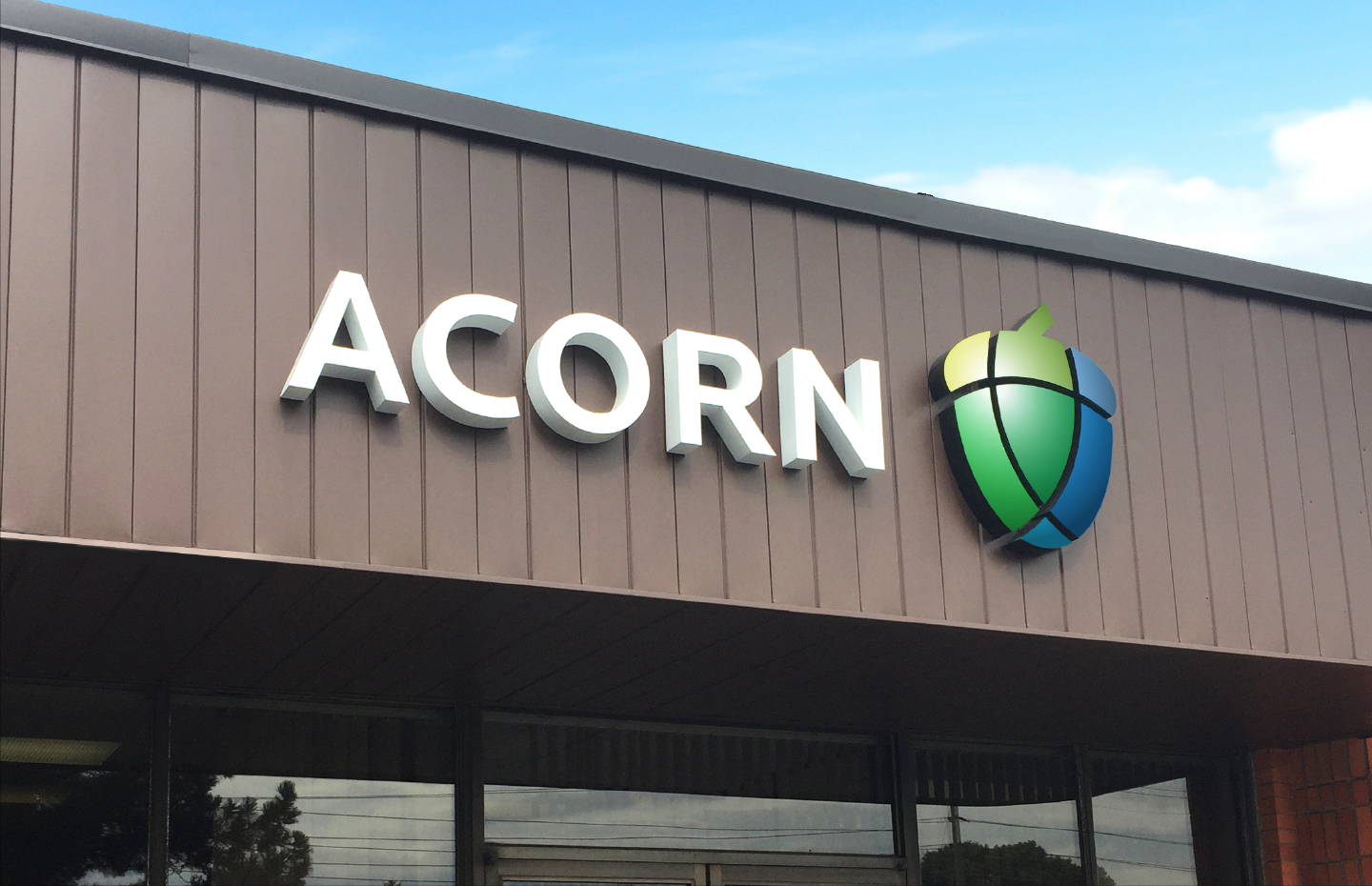
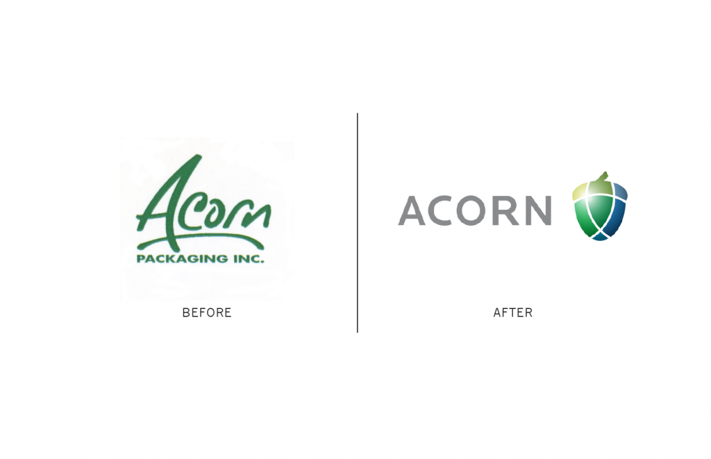
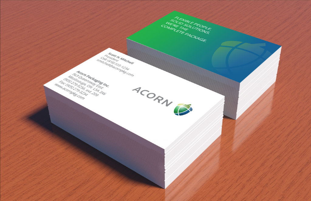
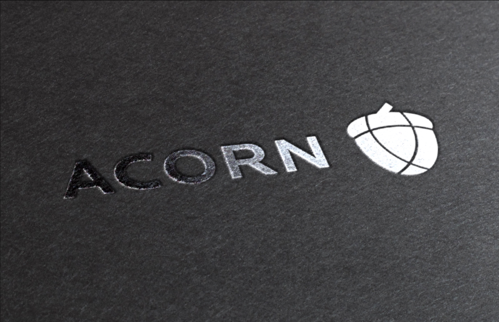
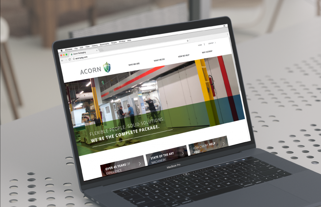
Acorn Packaging
Shifting perceptions into alignment with reality
Acorn Packaging
Shifting perceptions into alignment with reality
Acorn Packaging delivers state-of-the-art integrated flexible packaging solutions to major North American consumer packaged goods companies and retailers.
Following a change in ownership, we worked with them to reposition their brand, helping to overcome entrenched out-of-date perceptions of the company and clearly differentiate Acorn from the competition.
An audit of Acorn’s competitors’ websites, combined with customer interviews and group work sessions, provided insight into the business that helped guide the brand and design strategies and execution. The new brand strategy was expressed through an entirely new logo and visual identity system and executed through all touchpoints.
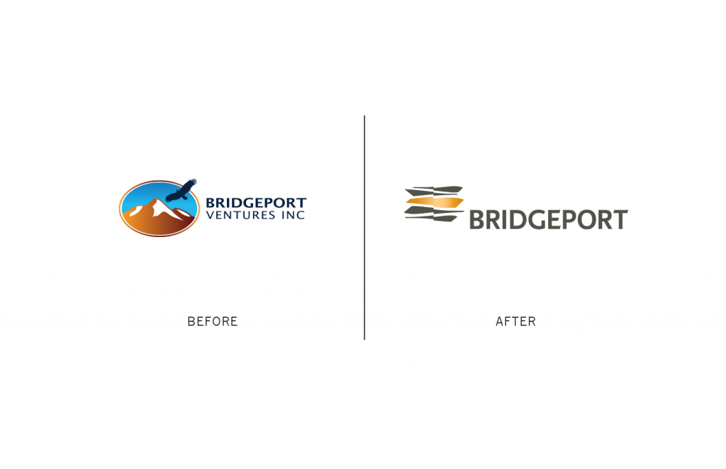
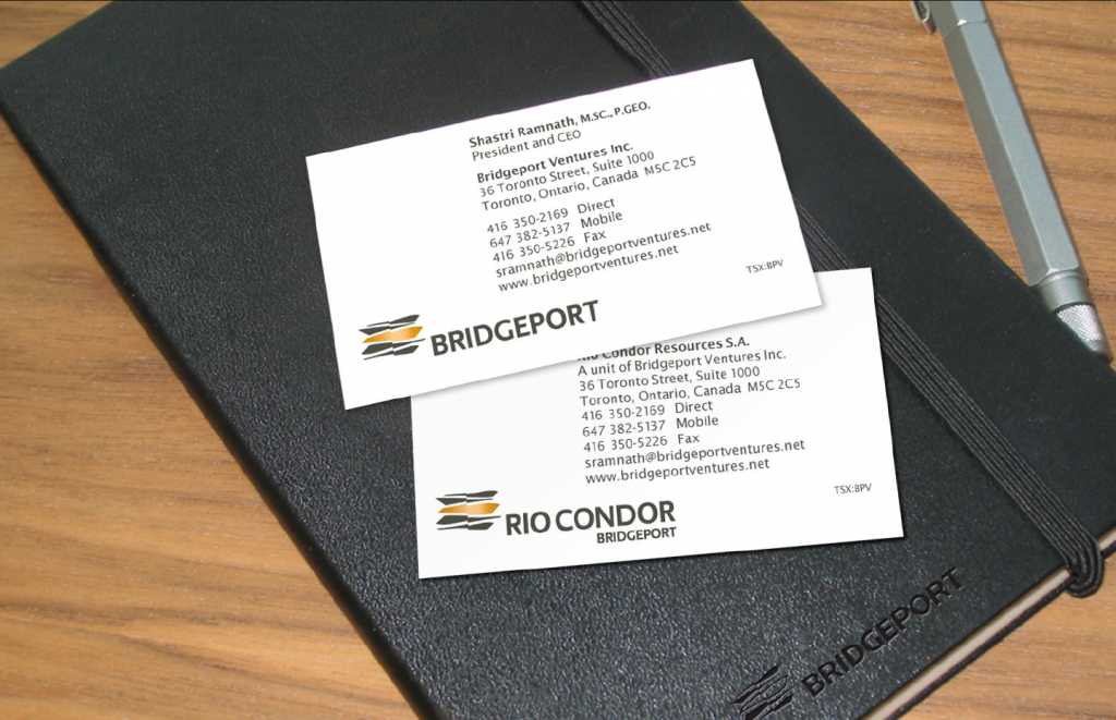
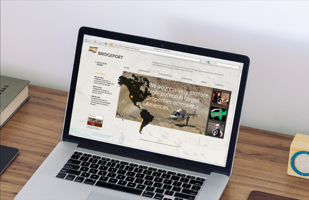
Bridgeport Ventures
Standing out in a large crowd
Bridgeport Ventures
Standing out in a large crowd
Bridgeport Ventures Inc. was (since acquired) a junior mining company primarily exploring for gold and copper-gold deposits in the Americas.
The company had experienced management and technical teams and a long track record of successful exploration, discovery, and development. Their key difference was using advanced 3D modeling technology to find valuable deposits where others couldn’t. While that was working for them, their existing brand identity wasn’t. It didn’t capture and convey the unique value of their brand.
We collaborated with Bridgeport to create an all-new, credible and differentiated logo and visual identity system, a clear positioning definition, and consistently branded communications so they would stand out in a crowded, competitive environment.

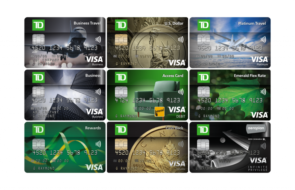
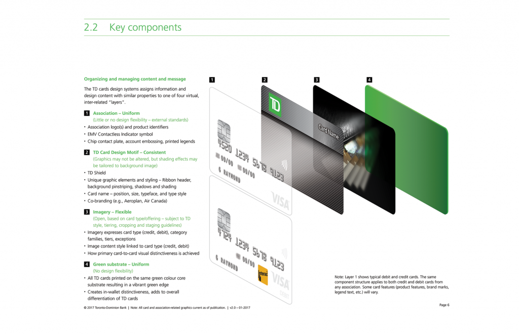
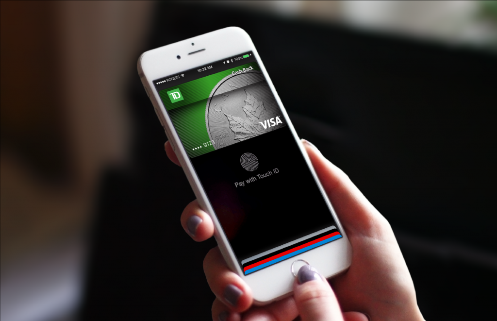
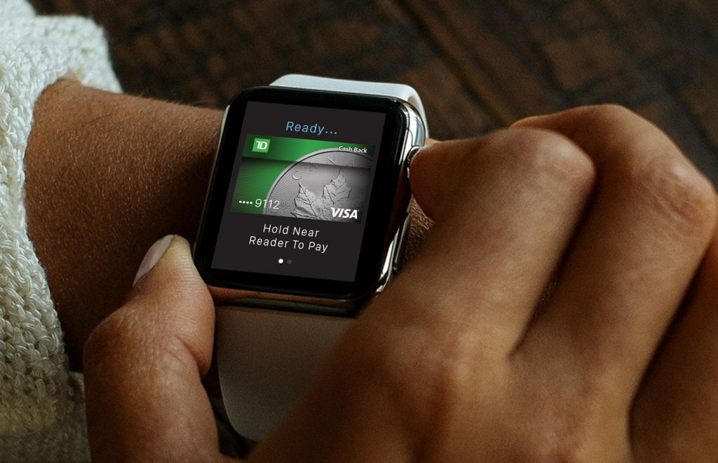
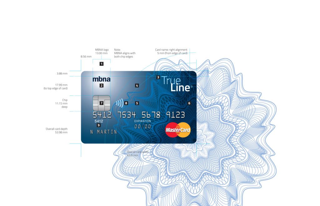
TD payment card design system
Strengthening an undervalued touchpoint
TD payment card design system
Strengthening an undervalued touchpoint
Payment cards (credit, debit, prepaid, and others) are key brand touchpoints for the issuer that provide an opportunity for brand reinforcement through thousands of daily impressions. Unfortunately, they’re seldom handled that way, and as a result, often aren’t planned and executed with brand considerations top-of-mind.
However, with the thoroughly considered and documented card design system we developed for TD – from card type and value category to image creation and detailed specifications – the bank has a ready blueprint and process for rapid development of new cards and for refreshing existing ones.
We’ve continued to work with TD – Canada’s largest credit card issuer – to implement the design system on all new card products, resulting in a portfolio that’s unique, differentiated, understandable, brand-consistent, and mobile-ready. The system has been successful in streamlining the development process and providing the flexibility to be adapted to new product lines.
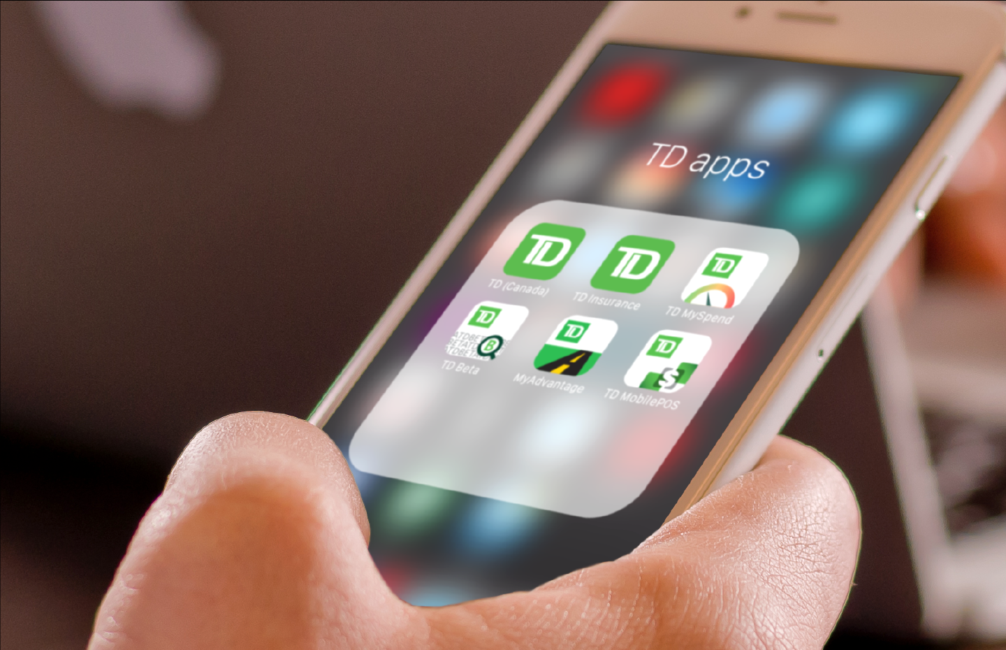
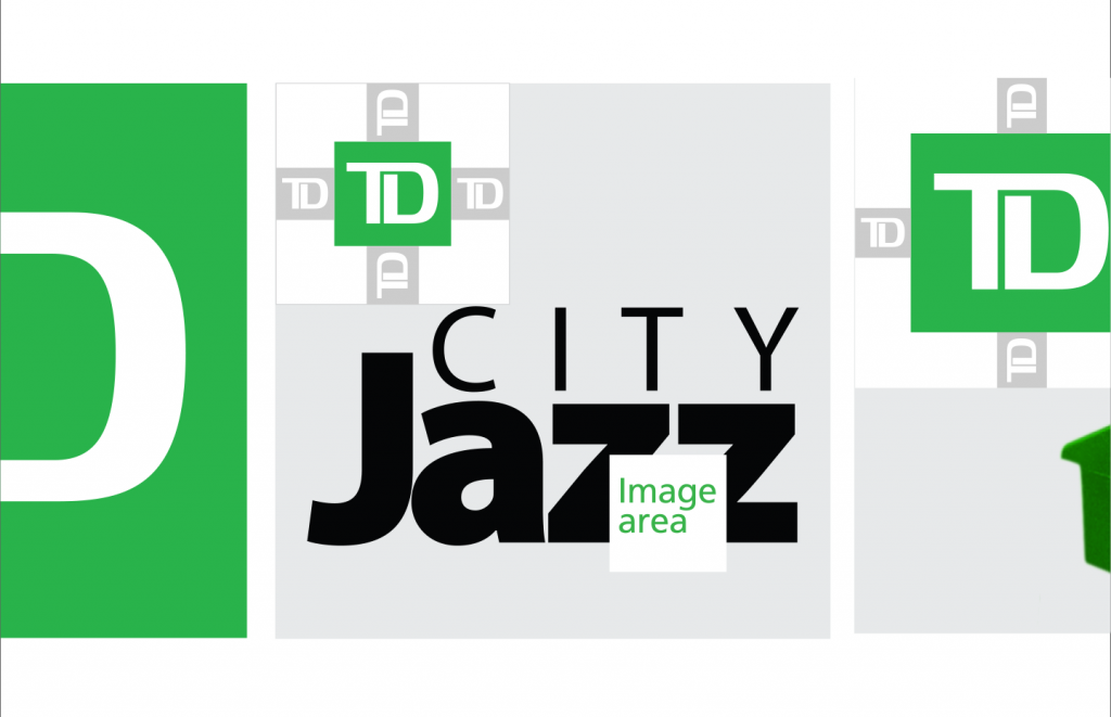
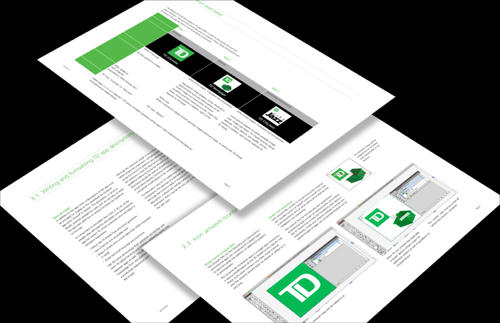
TD mobile app icon design strategy
Expanding the brand footprint
TD mobile app icon design strategy
Expanding the brand footprint
For many brands, it’s hard enough to make the leap to mobile, but what if you’ve already done it and now need a plan for expanding to a broader suite of specialized apps?
We worked with TD to create a system that would bring design consistency and coherency to their icons as they prepared for the growth of their mobile app family.
Not only did we express the corporate brand identify and clearly differentiate an open-ended number of offerings within multiple categories, we did so within a space where our “thumbnail” sketches were literally larger than life.
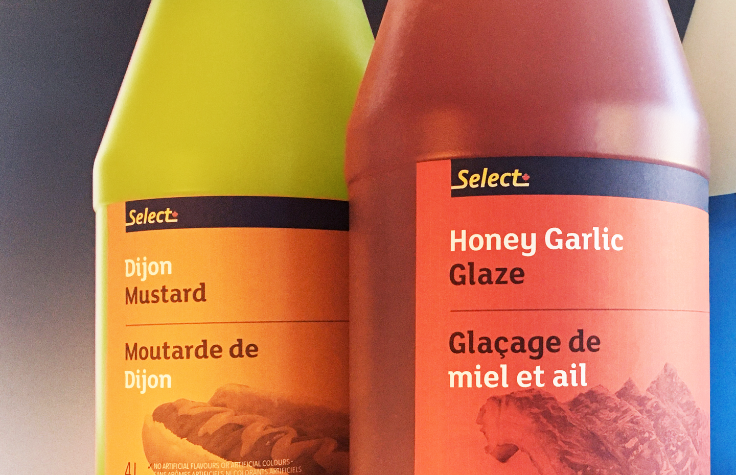
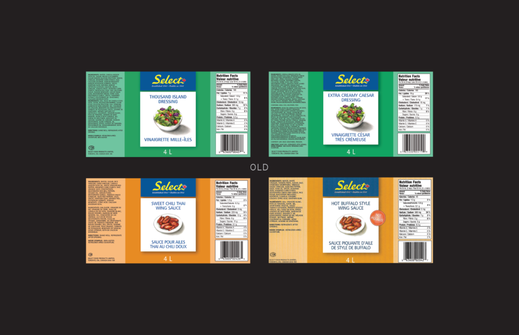
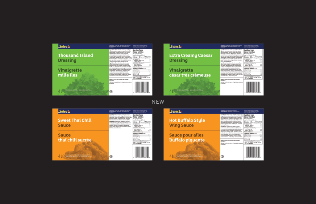
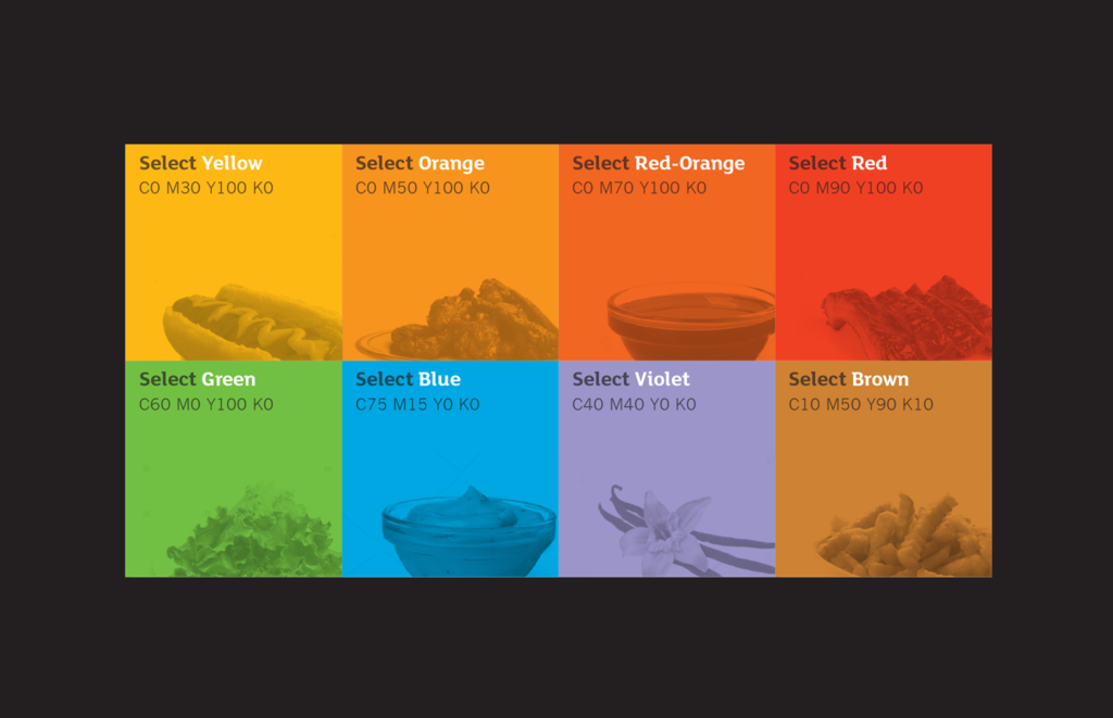
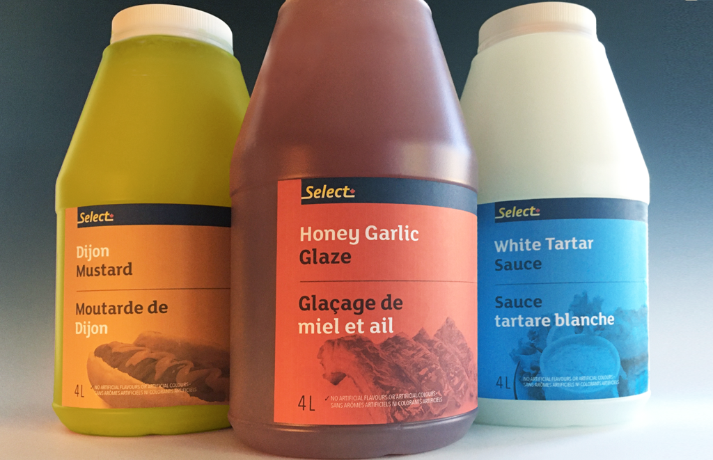
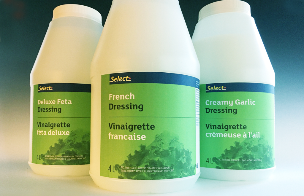
Select Food Products
Adding spice to foodservice labelling
Select Food Products
Adding spice to foodservice labelling
The new owner of Select Food Products wanted to modify the labels for their range of sauces and condiments to reflect new packaging regulations. Rather than simply update the tired legacy labels that came along with the business, they engaged us to explore how they could be updated and improved.
We conducted an extensive design exploration informed by a competitive audit, discussions with the internal team, and their print suppliers. The outcome was a recommendation that Select adopt a completely new, more efficient and differentiated design system, one that would better reflect how the needs of foodservice customers differ from retail consumers, be easier for their customers to use in a fast-paced working environment, and speed time-to-market for new and updated products.
Our design strategy shifted away from an unproductive retail-style approach. The new system emphasizes the product name through strong, characterful typography to distinguish offerings within product lines. We reduced the focus on ambiguous, repetitive, colour illustrations and instead enlisted monochromatic photographic images to act as category “icons”. The revised colour palette is now more powerful and coordinated.
The successful result is an attractive, distinctive, and highly practical label design system that is more appropriate to the customers and simpler and faster to produce.
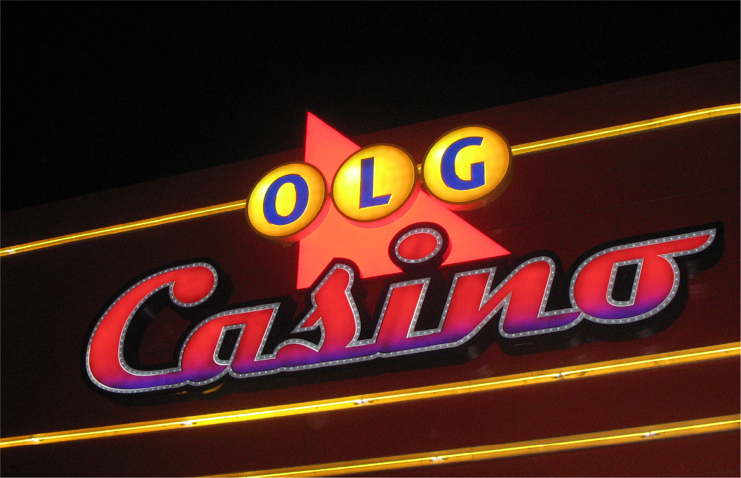
OLG
Managing perceptions of major change
OLG
Managing perceptions of major change
The Ontario Lottery and Gaming Corporation, a Crown corporation responsible for Ontario’s lotteries; commercial, charity, and Aboriginal casinos; and slot machines at horse-racing tracks; began an ambitious modernization initiative in 2012, recognizing a future of changing demographics and business imperatives.
We helped OLG redefine their corporate brand positioning and messaging to communicate a major change that would affect how they are perceived by their stakeholders: players, the general public, the media, various levels of government, and employees.
Brand drivers were identified through interview sessions with senior leadership and public focus groups to aid in creating this new positioning. We crafted the content and expressive language of key messages to guide public communications initiatives, clarify the brand image, and communicate a positive message of comprehensive change.
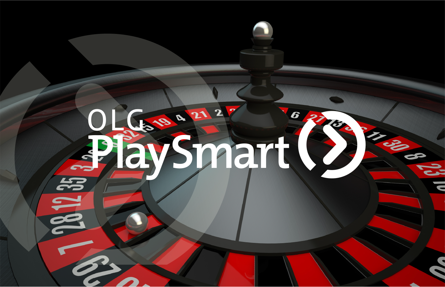
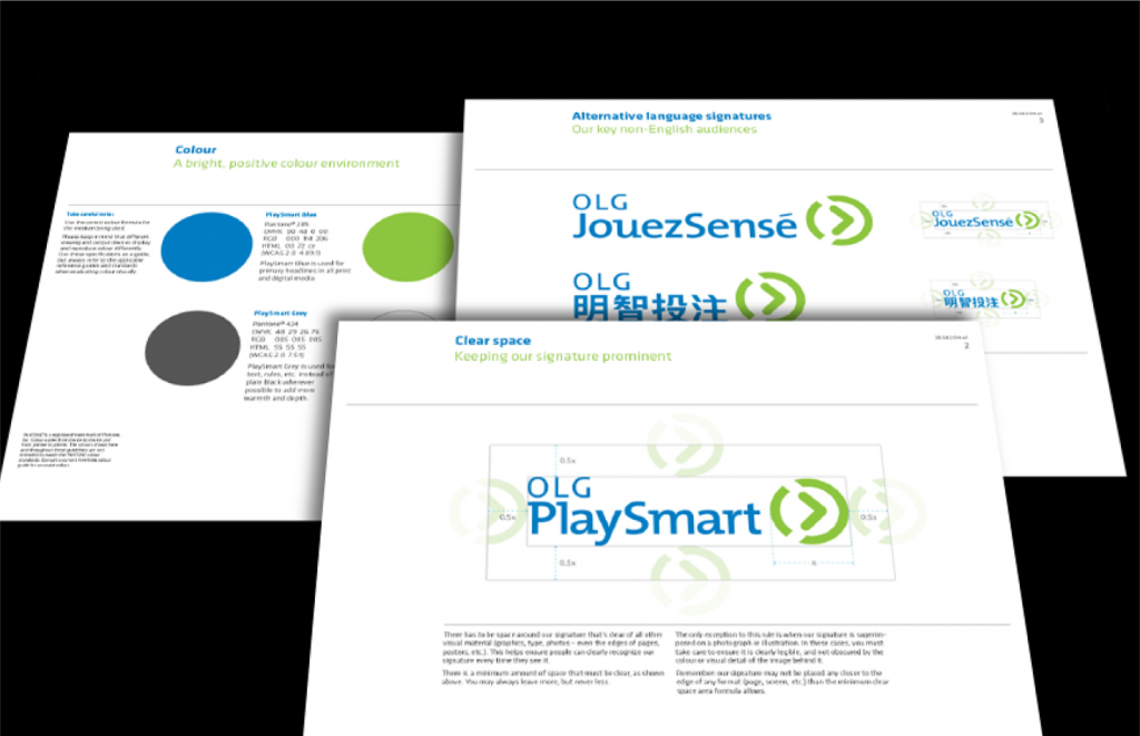
OLG PlaySmart
Creating broader and deeper relevance
OLG PlaySmart
Creating broader and deeper relevance
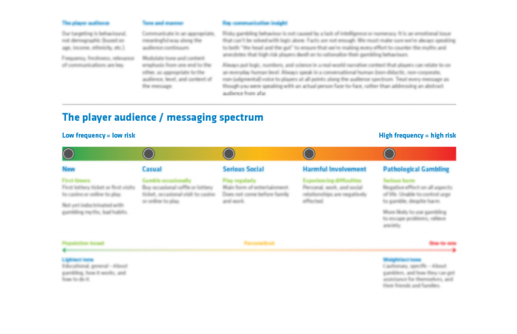
OLG’s Responsible Gambling team approached us with an intriguing and open mandate: How can we do more good for our players? The usual, broadly accepted approach had essentially been to try to use logic to counter a belief in luck, but that hadn't yielded the desired results and wasn’t likely to in the future.
We conducted a thorough analysis of OLG’s situation, industry data, the various inputs and resources available to players at every stage of their engagement, and interviewed key OLG and public health-related stakeholders (e.g., CAMH, Responsible Gambling Council). The result was the creation of a comprehensive, tiered player education strategy. Further it was to be named and branded as a distinct flanker sub-brand of OLG. This offered a number of strategic benefits. It would bring distinct focus to the new program, help allay possible concerns about mixed mandates for the seller/educator, and to make it “ready” if at some point the brand was to be applied in conjunction with the identities of gaming operators other than OLG.
MBNA
Adding life and excitement to a brand identity
MBNA
Adding life and excitement to a brand identity
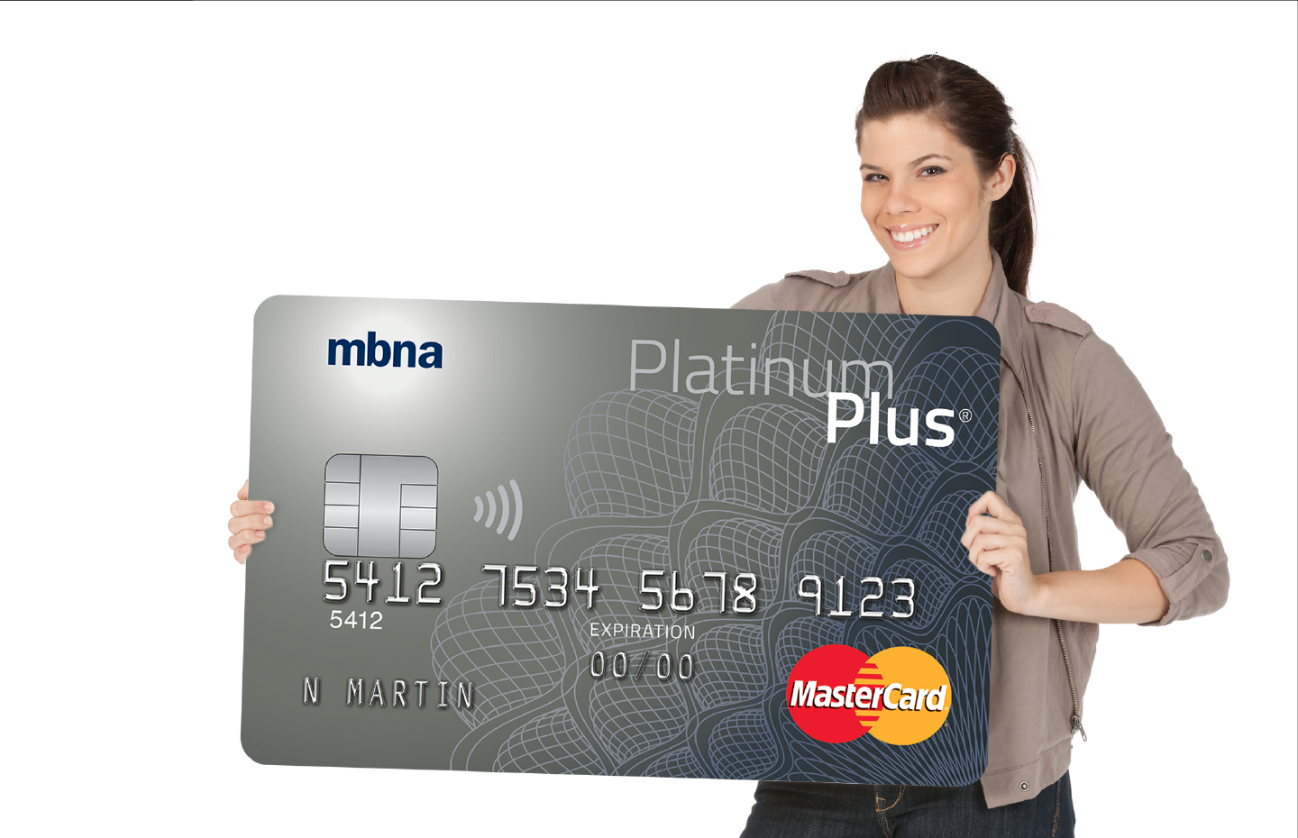
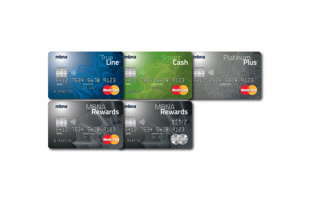
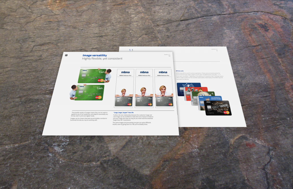
When TD acquired the MBNA brand and credit card business in Canada, renewal of all facets of Canada’s largest Mastercard issuer’s brand identity was called for.
It was decided their simple and recognizable logo would remain, serving as the anchor for a completely new and comprehensive look and feel brand system. The branding put the customer front and centre with the product in a fresh and effective way – exciting, distinctive, flexible – yet visually leveraging a familiar presence adaptable to all media.
The MBNA-branded credit card portfolio was completely redesigned and rationalized to align with and reinforce the new visual identity, and elevate perception to more effectively serve its flanker-brand positioning. As well, we developed an extended design system to provide coherence through MBNA’s extensive and diverse affinity co-branded credit card suite.
We Financial
Activating customer attention
We Financial
Activating customer attention
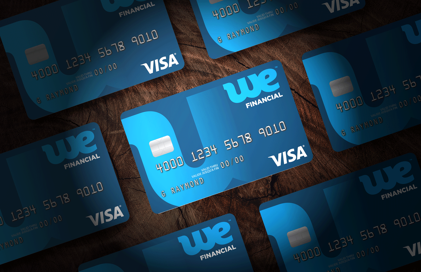
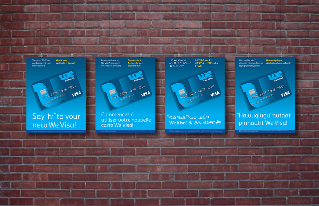
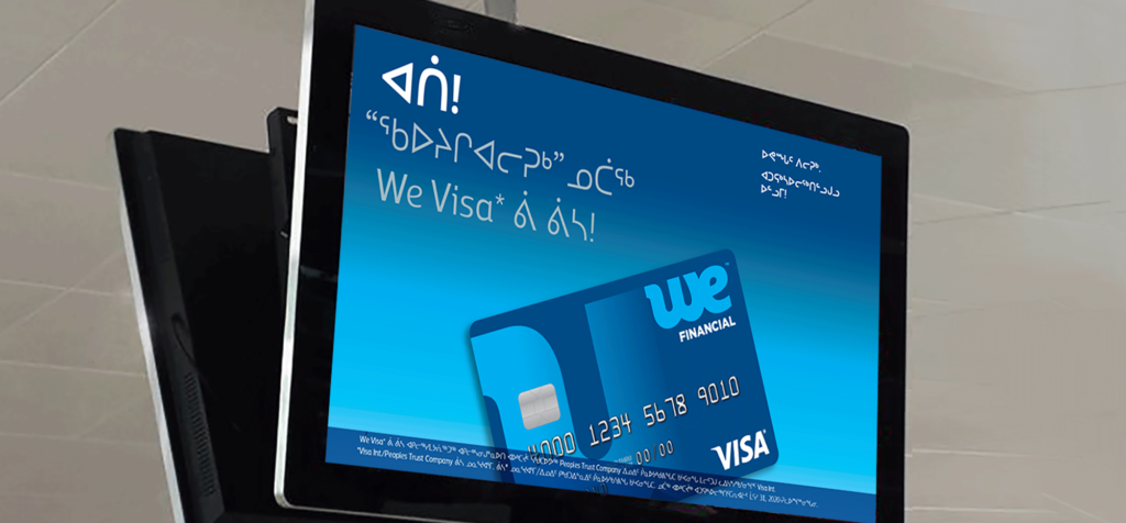
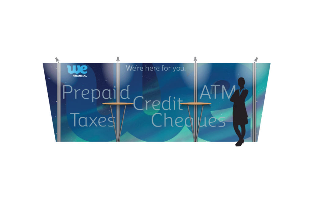
We were engaged by The North West Company to create excitement around a new version of their We Financial Visa Prepaid Card that their existing customer base would receive and be asked to activate within a set time period.
We began with the redesign of the card to make it more dynamic and contemporary, and to better leverage the visual language of their branding.
The new look, feel, and personality were applied not only to the typical card collateral (brochure, card carriers, envelopes, statement inserts, etc.) but also to a multimedia activation launch campaign encompassing a broad range of social media and screen applications (e.g., Facebook, website ads, in-store digital displays, a variety of formats for ATM and cash register screens) as well as printed in-store posters and display panels.
The successful launch was supported with an internal tradeshow display and followed up with a second external marketing campaign, all executed in English, French, Inuktitut, and Inuinnaqtun.
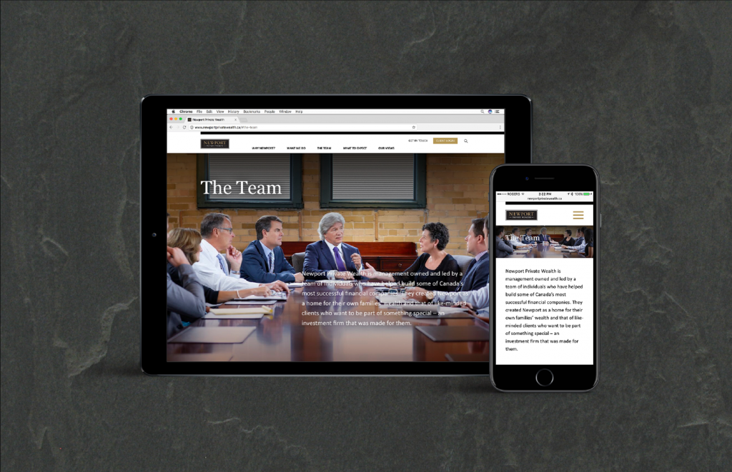
Newport Private Wealth
Making the telling match the story
Newport Private Wealth
Making the telling match the story
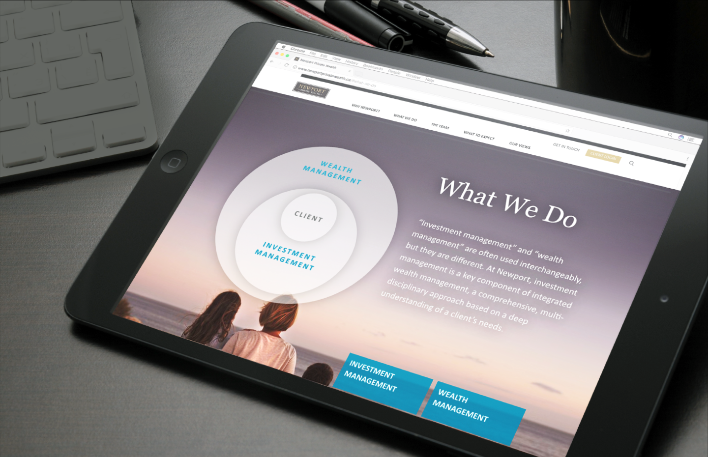
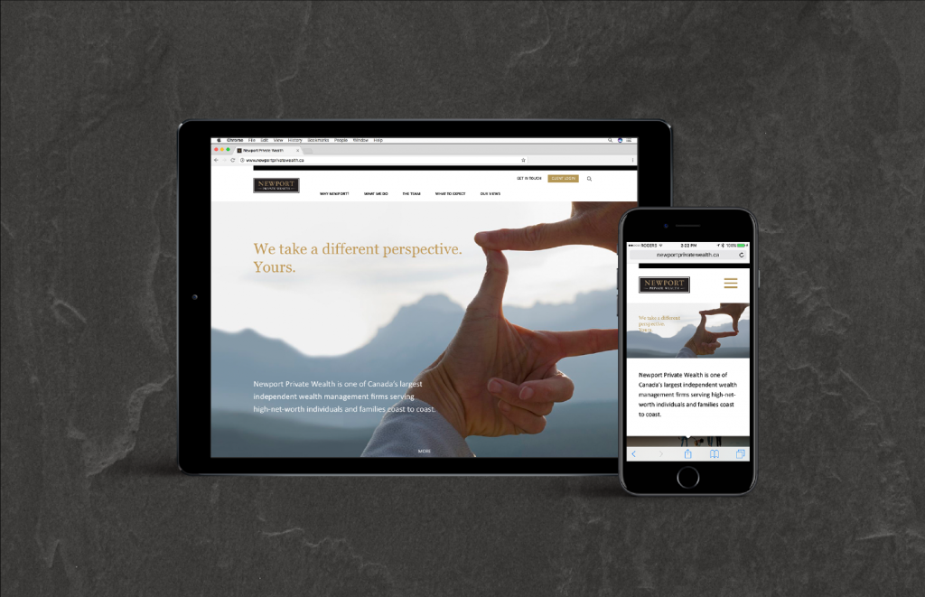
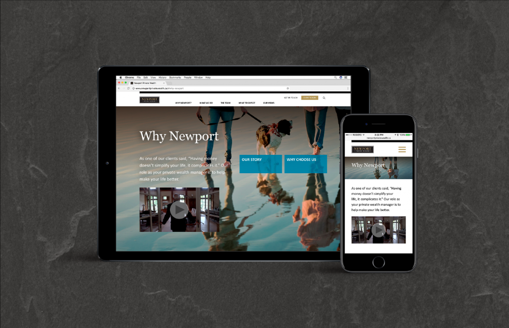
Newport Private Wealth is a wealth management firm serving high-net-worth individuals and families across Canada. Their website is a key point of contact for developing relationships with new and existing clients.
Their site has to hit all the marks in telling a story that’s compelling and thorough enough to persuade a discerning audience to take that next step. Unfortunately, it hadn’t kept pace with the evolution of the brand or with competing online brand communications. The way their story was being told no longer did it justice.
We developed a new site structure (in collaboration with web specialist Office/Bureau) to tell the Newport story in a simpler, linear fashion, while allowing the user to navigate as they please without getting lost in nested links. We also created key messaging for the main sections and consulted on the conceptual and script development of the featured video.
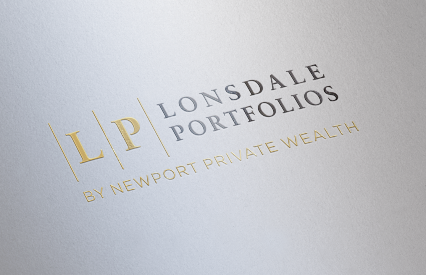
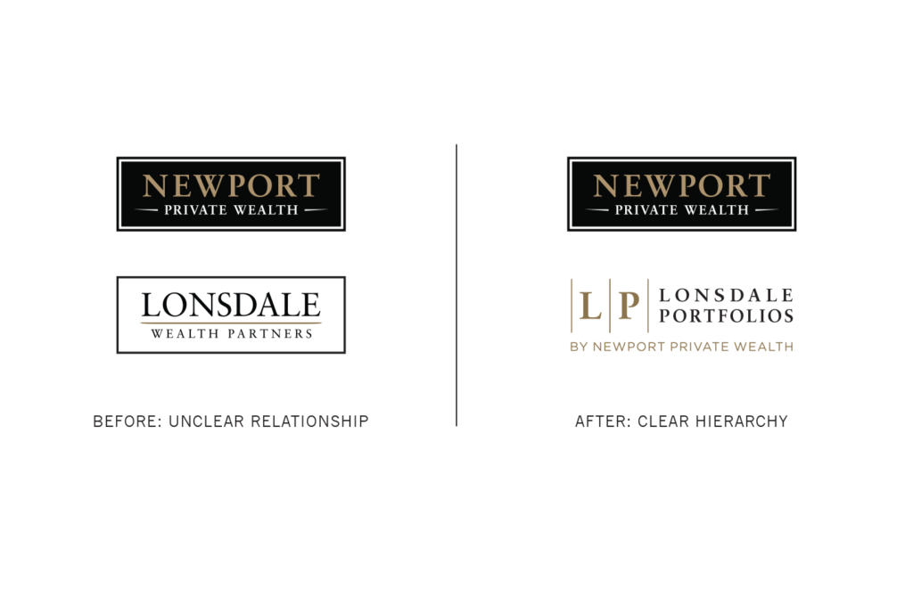
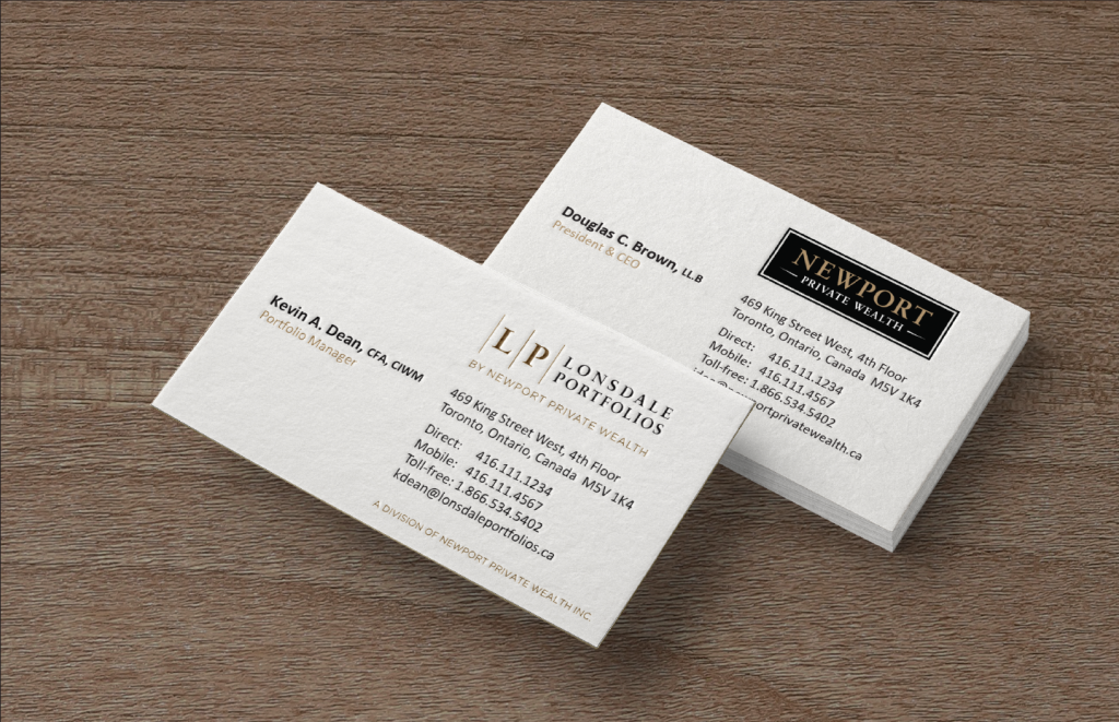
Lonsdale Portfolios
Renovating brand architecture
Lonsdale Portfolios
Renovating brand architecture
Newport Private Wealth is a wealth management firm serving high-net-worth individuals and families across Canada. They had launched a sub-brand – Lonsdale Wealth Partners, aimed at mass affluent clients with third-party advisor relationships – but found that it didn’t so much expand the perception of the parent brand as create what appeared to be a parallel brand, with similarities between go-to-market strategies and verbal and visual identity expressions that had the potential to confuse clients.
To differentiate the two, we first needed to focus the brand messaging for the Newport parent brand so that we could appropriately and distinctly position the Lonsdale sub-brand relative to it. We proposed a new name – Lonsdale Portfolios – as a more direct indication of a product offering, and added an endorsement statement to ensure its hierarchical relationship with the ultimate source of brand value was clear. We adapted the graphic language of Newport to create a new visual identity to stake a premium positioning for Lonsdale relative to the competition, while simultaneously leveraging the close association with, and protecting and enhancing the more exclusive and fulsome Newport Private Wealth offering.
Flexiti Financial
A versatile credit alternative
Flexiti Financial
A versatile credit alternative
Flexiti Financial is a fintech company and one of Canada's leading private label credit card issuers.
Originally a purely digital point-of-sale consumer financing solution, the FlexitiCard provides added convenience for the customer. Cardholders can shop at any retailer in the ever-expanding Flexiti Network and enjoy a range of financing options unavailable through conventional credit card issuers.
The card is designed to visually align with the Flexiti brand and provide a credible, sophisticated wallet presence on par with high-end credit cards.
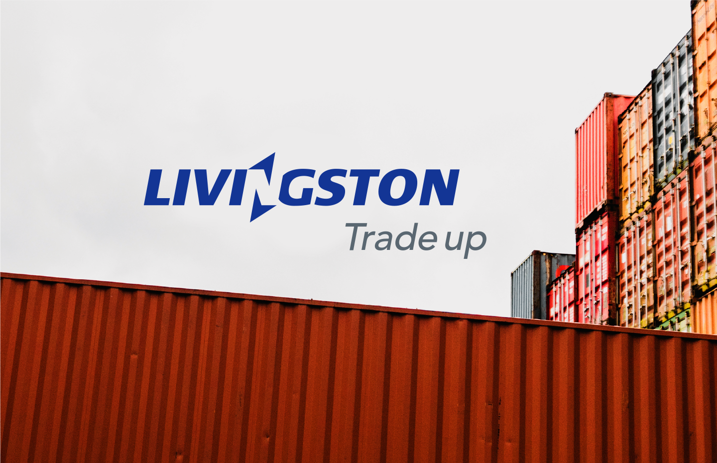
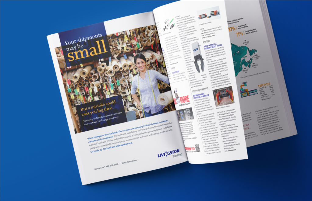
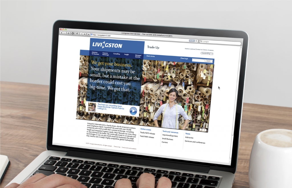
Livingston International
Defining a position on a big new playing field
Livingston International
Defining a position on a big new playing field
Livingston International is – as it has been for many years – Canada’s foremost customs brokerage and compliance brand. To meet its growth targets, Livingston set upon an aggressive growth strategy of acquisition.
The U.S. presented the best opportunity, but Livingston was not well known there. They needed a strategic repositioning of their brand that would enable an aggressive “challenger brand” stance against firmly established players, like FedEx and UPS, but preserve the long-standing equity of the brand with a committed client base in Canada. The brand positioning and expression had to appeal equally, and credibly, to potential clients and potential acquisitions.
After a series of internal workshops, and following external insights derived from customer research, the result was a new brand positioning expressed through an evolved brand identity program. It comprised refreshed visual and verbal assets that included a fresh tagline, an image library, a refined colour palette, and updated typographic style. This was broadcasted by expansive use of print, digital, and social media targeting their highest-value audiences. (In collaboration with Profis.)
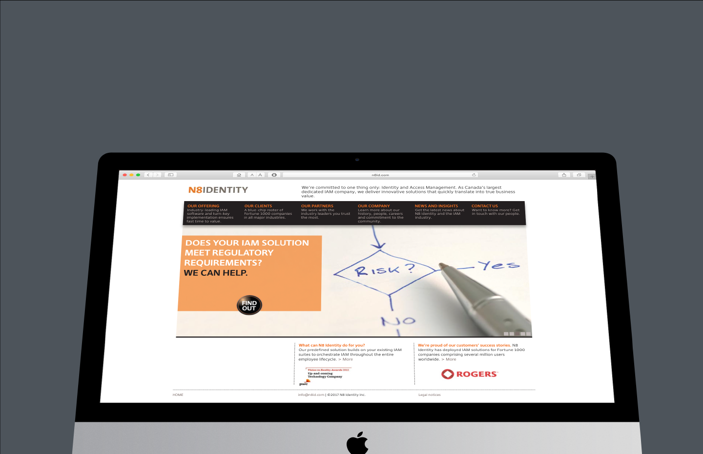
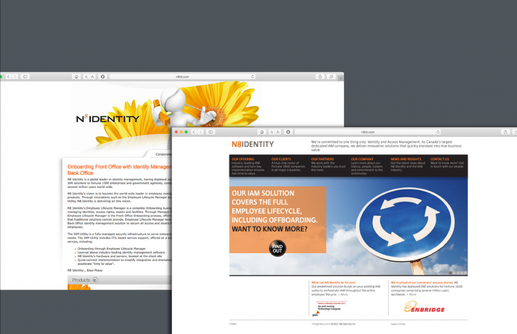
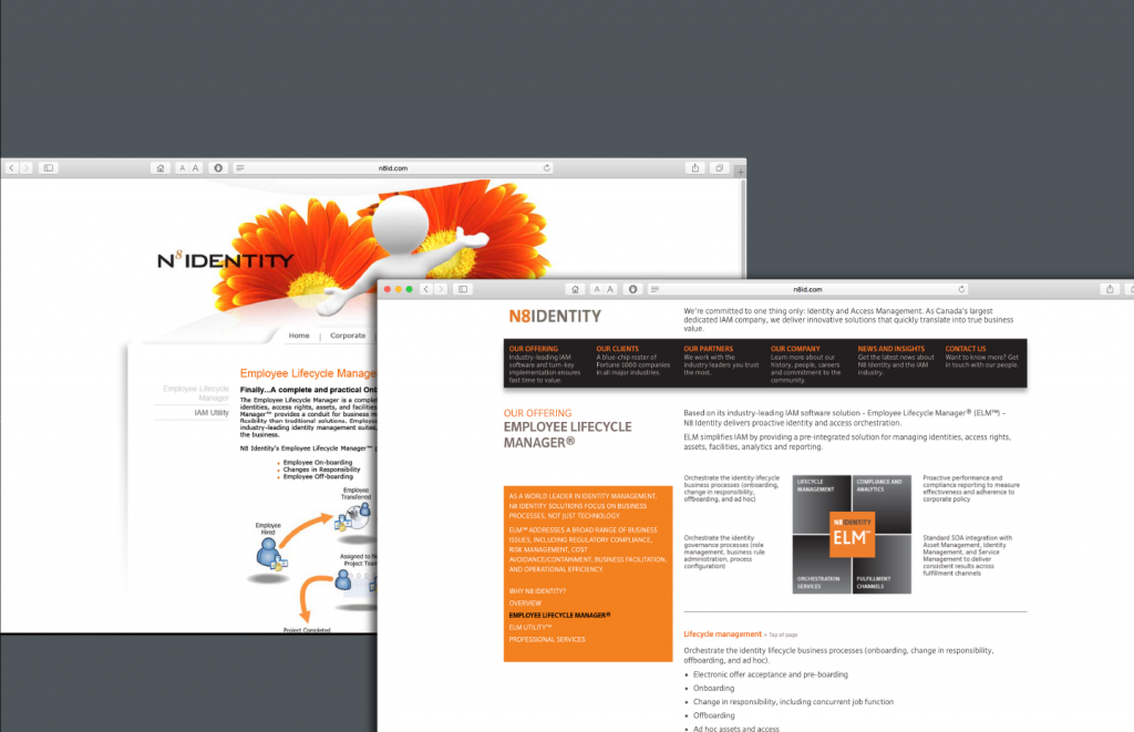
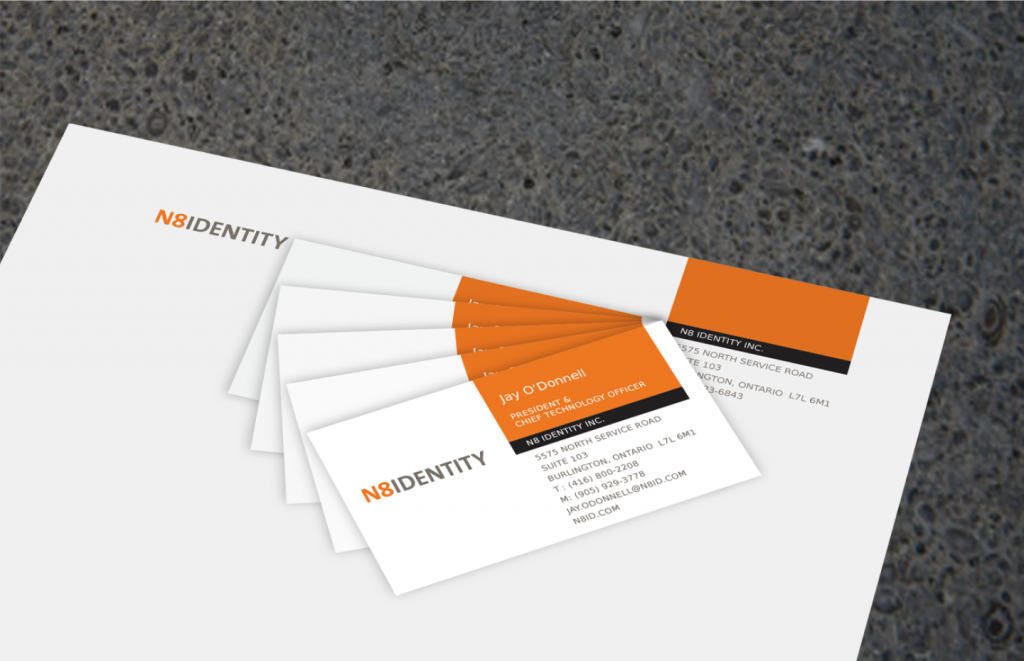
N8 Identity
Streamlining complexity
N8 Identity
Streamlining complexity
Canada’s largest dedicated identity and access management (IAM) solution provider, N8 Identity has an impressive roster of clients. Yet, while being respected leaders in the industry, they were not well known to potential clients.
Their offerings are technically complex, long-lead-time selling to high-level executives in different functional groups of large companies. Our brand audit of the company and its competitors, combined with one-on-one and group work sessions, uncovered insights about the business that helped guide the design strategy and execution.
Based on our recommendations, the brand identity was refreshed to present more credibly and to differentiate N8 Identity from their competitors; a new, future-ready website was designed, structured, and written to tell the N8 Identity story more effectively – simplified and streamlined – with new features and CMS functionality; and new document and marcom templates were deployed, along with updated business stationery.


Sunnybrook Health Sciences Centre
A check-up for a major health brand
Sunnybrook Health Sciences Centre
A check-up for a major health brand
Sunnybrook was anticipating a merger with a smaller, specialized care provider and were concerned the merger had the potential to test the credible stretch capacity of their existing brand positioning, their visual and verbal identity, and the brand architecture that expressed these coherently. Despite having gone through a rebranding process over the previous five years, they realized they still lacked a comprehensive road map for their brand that anticipated the future evolution of the organization.
Our work encompassed an in-depth review and evaluation of the positioning and visual identity of both entities, a top-level audit of their immediate competitors, and a survey of brand practices in the wider healthcare sector. We uncovered information that illuminated the key issues contributing to their concerns.
Armed with new insights, we developed recommendations for targeted changes to help future-proof the brand and provide the assurance they could move forward with confidence in the short term.
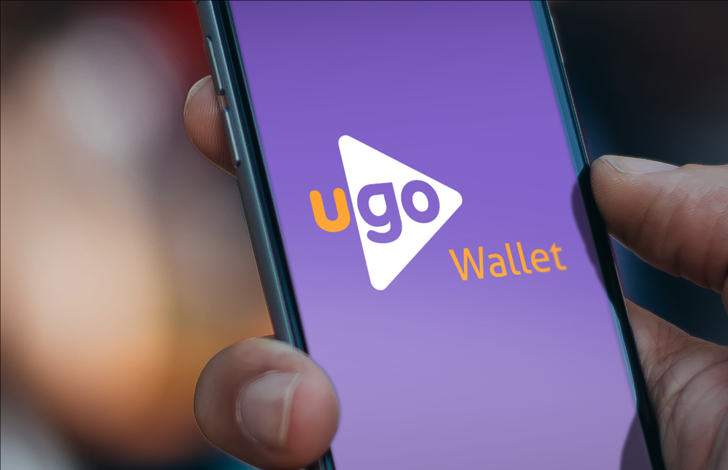
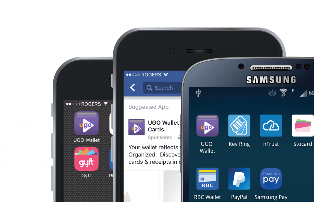
UGO Wallet
Creating a dynamic balance
UGO Wallet
Creating a dynamic balance
With UGO Wallet (a joint venture of TD and PC Financial), consumers can pay, earn, and redeem loyalty points with a single tap on a smartphone. This innovative solution offers functionality that could ultimately eliminate the need to carry an actual wallet.
Following extensive research into this highly competitive and quickly evolving product space, we developed the name, logo, and visual identity system for the app and the joint-venture entity. Key elements of the challenge were that the name, colourways, and overall brand identity had to be distinctive in the broad Canadian financial services and grocery retail sectors, and function equally well in each. The brand mark was purpose-built to register strongly at the reduced scale of mobile media.
After the initial product launch, we were brought back to continue the initiative with the design of more consistent, brand-centric iconography and to further develop the UGO Wallet visual identity and brand/product architecture system.
What we are
Hark Ideas is an independent brand strategy, design, and naming consultancy working to create, evolve, and communicate successful stand-out brands. We collaborate with enterprises large and small, established and start-up, to help build and express authentic, differentiated brands that resonate with stakeholders through inspired strategy, graphic design, and messaging. Our focus is always fixed on actionable results.
We believe that great ideas start with great listening.
Who we are
We bring you extensive experience working together and with other firms, solving brand design and communications issues for clients – locally, nationally, and around the world – through strategic solutions executed in print, digital, and environmental media.
The right expertise. The right approach. The right outcome.